Atelier de Mundos - Logo
Atelier de Mundos is a child-focused brand creating enrichment experiences through exploration of various worlds - art, science, nature, and history. Atelier de Mundos, based in Mexico City, MX, sells products, activities and toys to enhance the learning environment inspired by the pedagogies of Reggio Emilia, Bruno Munari and Friedrich Fröbel. Inspired by these pedagogies and designs of Bauhaus, a playful logo was designed to celebrate exploratory and imaginative play. Geometric shapes were combined to create the logo, representing how a child can use imaginative play to create something new. The color scheme replaces the traditionally used elementary colors of red, blue, and yellow with a more youthful color palate of magenta, cyan, and yellow.



Amakela - Logo
A logo was designed for Amakela, a production house specializing in Mini-Documentaries. The company name comes from the indigenous Peruvian/Incan phrase “Ama Quella,” which means passion for what you do and create. The logo reflects indigenous characteristics with a minimalistic and contemporary feel.
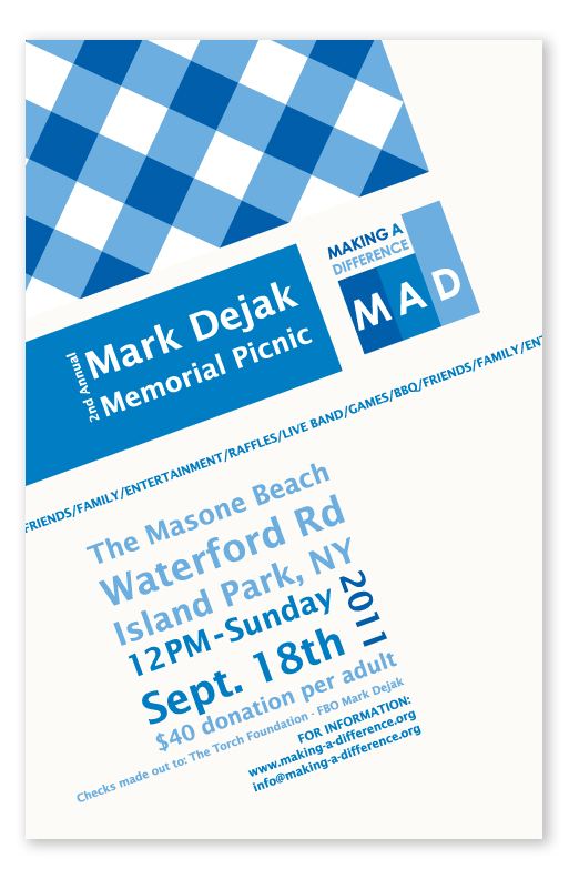
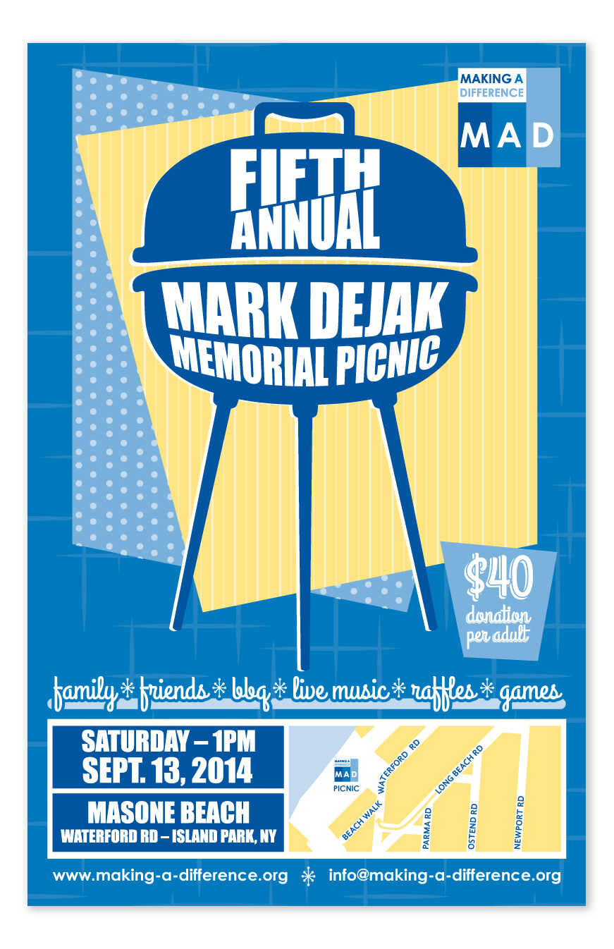
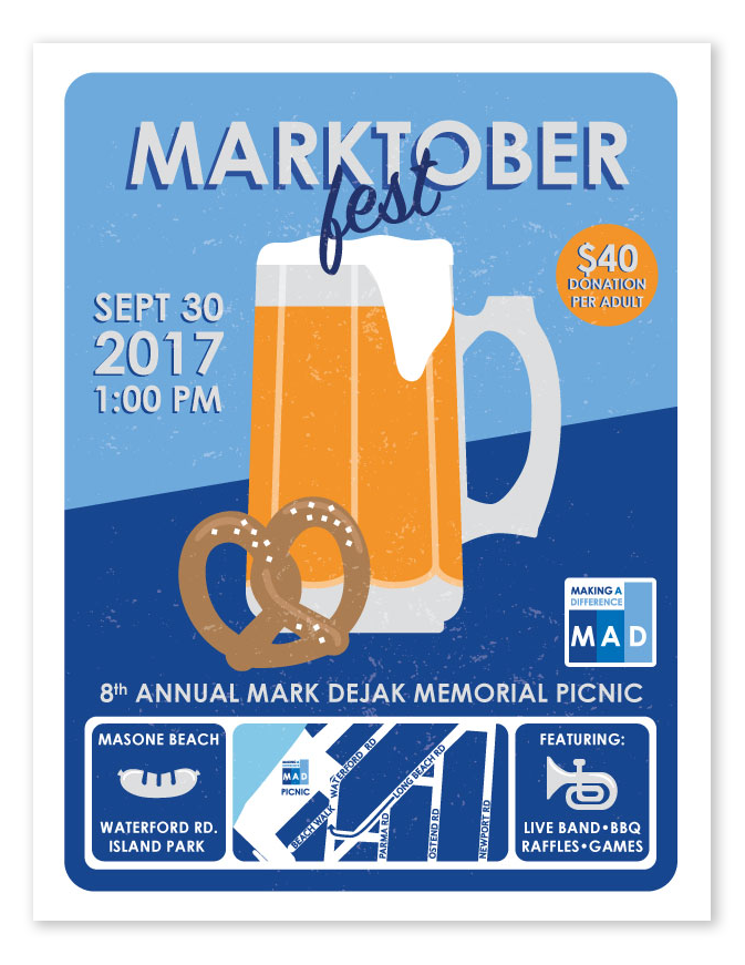
Making-A-Difference Foundation - Logo and Print
The Making-A-Difference Foundation is a non-profit, charitable organization based in Long Island, NY. A logo was designed with the MAD Foundation mission statement in mind. The first two rectangular blocks represent the foundation for building something new. The larger block shows that growth and positivity can be achieved through the efforts of the foundation. The color gradient from dark blue to light blue represents the turning point of something negative to positive. In addition, print posters and supporting assets have been designed to promote annual fundraising efforts and events.
